A brand is a company’s perception. It includes a logo (corporate identity), color palette, specific fonts, unique messaging, photography style and graphics (to start). A brand is a feeling or impression that a person senses when interacting with it. Businesses use branding to set themselves apart from their competitors and convey a particular advantage of their service or product.
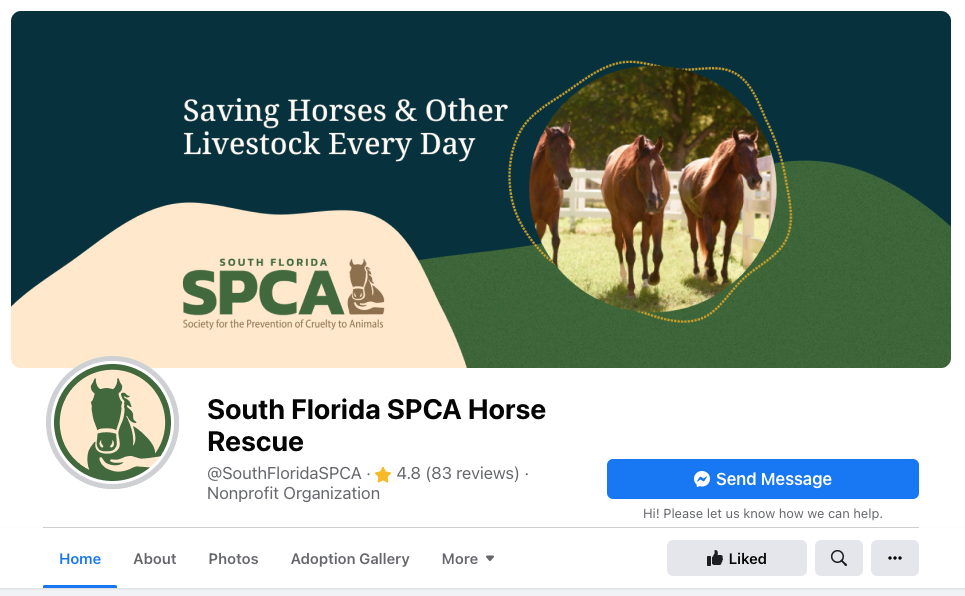
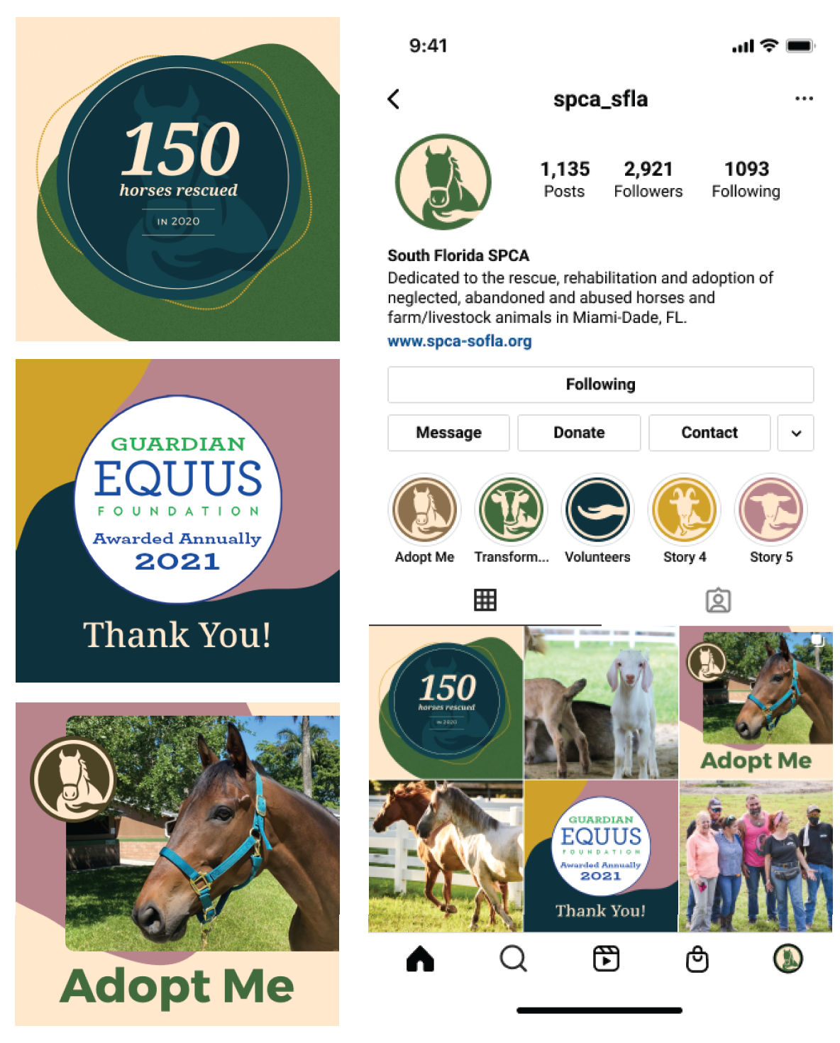
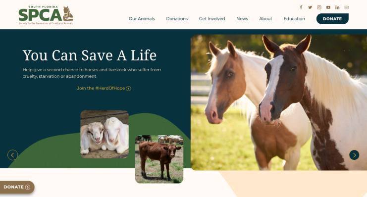
SFSPCA’s brand image reflects the ‘Helping Hand’ they lend to animals in need of rescue, rehabilitation and love. The bold font face was kept for the ‘SPCA’ to retain recognition of the original logo. The colors and textures are all found on the Homestead ranch.
RASF specializes in quality & ethical pharmaceutical clinical trials. Their logo needed to represent their emphasis on the health of their patients as its top priority. The addition of nature helps to portray their mission of promoting the growth and nurturing their patients.
Santa Fe Hydes’ brand reflects the quality of this new collection of leather goods. Contemporary fonts were chosen for their luxurious feel. The dashed line mimics the thread along a garment’s seam. The color palette and subtle natural textures are inspired by New Mexico and provide a high-end, earthy feel. View Site
CMP Consulting needed a rebrand for their Miami-based computer service company. We collaborated with CMP to create a logo and brand which uses the hex and simple geometric shapes to exemplify efficiency and technology. The colors help market their various services.
For Runcentral’s rebrand we incorporated a contrasting color to their palette to bring a more contemporary feel to the brand. We created simple graphic elements to symbolize the centralization of varied online systems and managed services which Runcentral provides.
Darlene needed a new brand which would embody the spiritual and physical healing her new business brings to her clients from nutrition to Ayurveda. The logo symbolizes growth and the overlapping branches portray connectedness. The symmetry portrays alignment and balance. Both the heart chakra and heart are present.
Softshell Design worked with CHRISTUS St. Vincent hospital to help build a brand and temporary website for Strong Women of New Mexico. This campaign was created to help promote the local breast cancer walk in Santa Fe. Bold colors, heavy fonts and icons helped to give a sense of strength and vivid energy.
SFT&T needed a new brand for their weather / time call service which has served Miami-Dade and Broward counties since before WWII. They needed a logo that immediately told our audience about the service in symbolic form. Versions were provided including phone numbers for integration into printed materials.
Genuine Enthusiam
Welcome to the future.
Nowadays no marketing campaign is complete without a social media arm. It’s a new way of marketing that will be here to stay and is especially advantageous in attracting a younger audience and larger following.


A website is your business’ best marketing tool.
Find your angle.
An integral part of marketing is examining your business to pinpoint what sets it apart from its competitors. What makes your company special may be the same thing that inspires customers work with you.


